


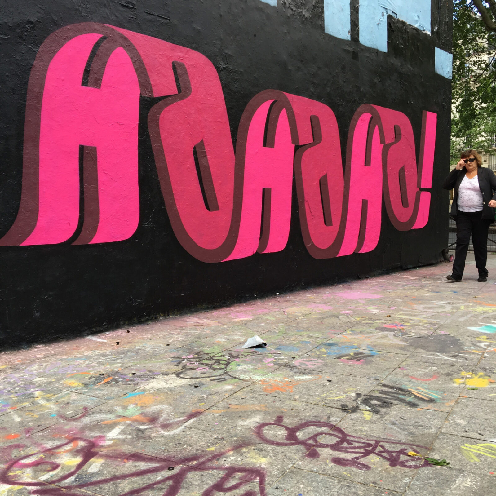
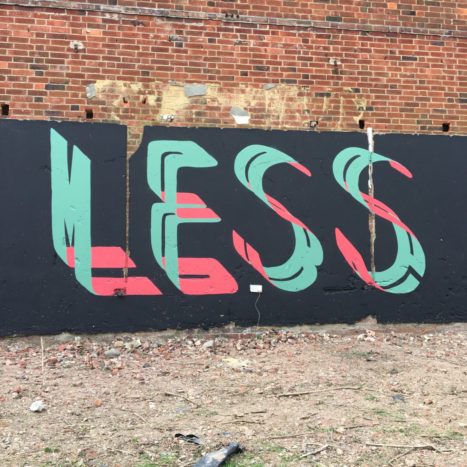
British graffiti artist Pref explores words and common phrases through unique multi-layered murals. His 3D text is used to create amalgamations of quippy sayings, often placing one word inside of another to give a piece multiple perspectives. In the work below a turquoise “more” subtly shifts into a salmon “less” simply by a twist of the viewer’s head.
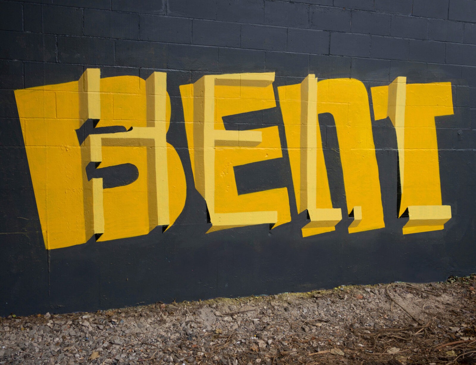
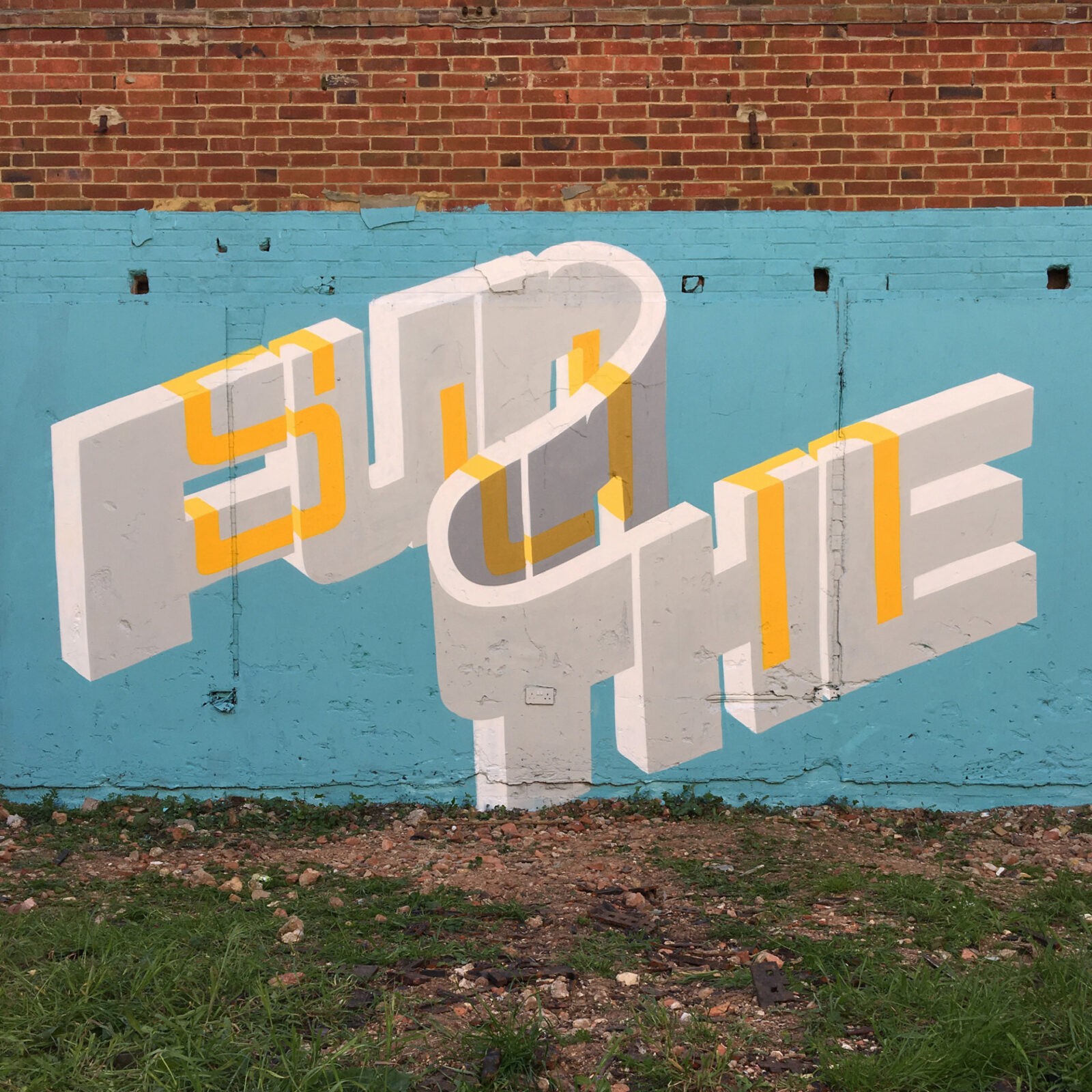
Since he got his start nearly two decades ago, Pref has been interested in challenging graffiti’s aesthetic, working with typography to bring a more accessible appearance to painted text. At first the street artist worked with the negative space between letters, which eventually became letters themselves. This transformed into his signature style of combined texts, which he has been exploring since 2010.
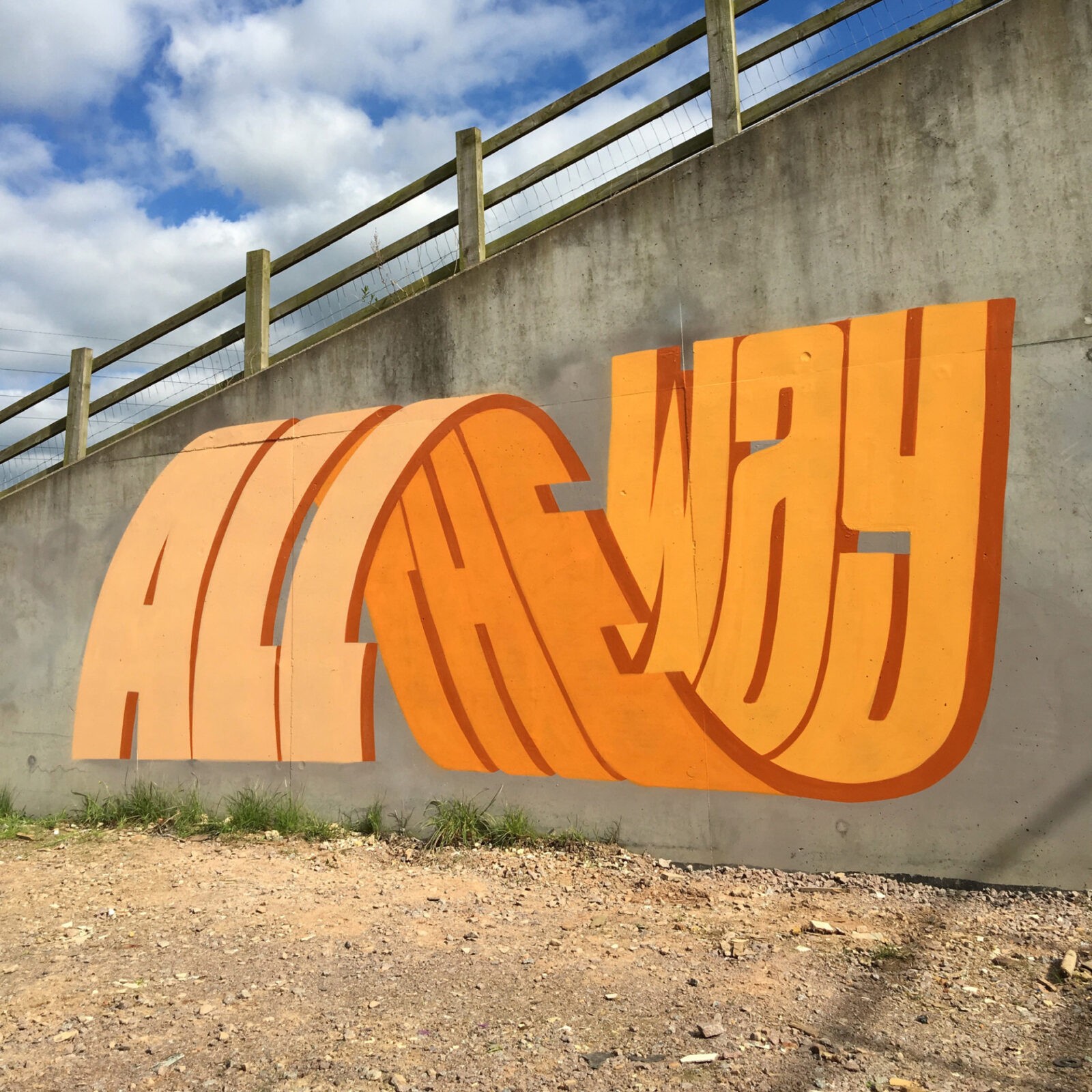
“Since then I have pushed and experimented with this idea of overlapping words, seeing how many I can fit into the space of one word, and then slowly boiling it down and simplifying this idea to become more legible,” he told. “This in turn lead more to the use of ‘typography’ throughout my style as you see today. I have always been interested in the idea of graffiti speaking to the general public, rather than just other graffiti writers, and readable letters or a more ‘typographic’ approach has been a good route to that.”
Recently Pref partnered with fellow typographic street artist Gary Stranger to launch a collective titled Typograffic Circle. The group unites artists working in the type-based street art subgenre, and their first self-titled group show is on view through June 3, 2018 at London’s StolenSpace. The exhibition features work by Georgia Hill, Saïd Kinos, All Type No Face, along with Pref and Stranger. You can see more of Pref’s recent work on his Instagram and buy select prints through his Big Cartel.


