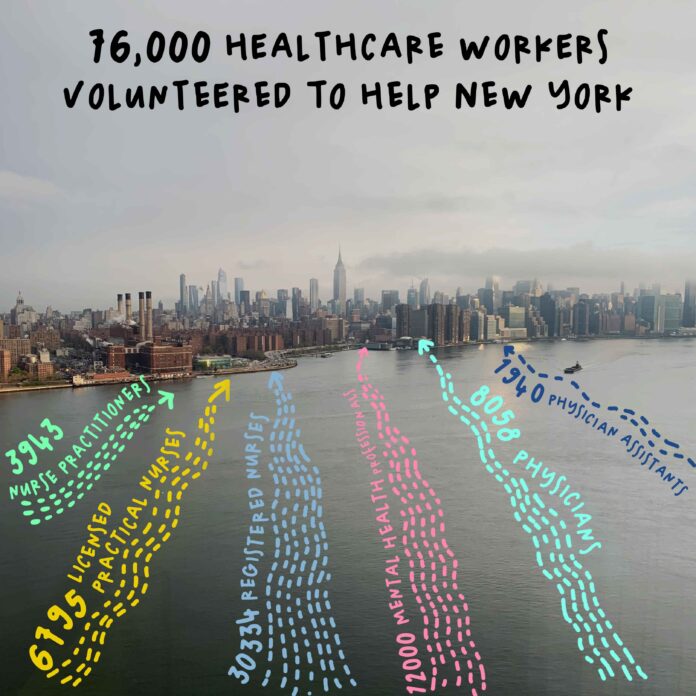
The COVID-19 pandemic has been the dominant topic of the world for news organizations, with infographics and articles detailing total cases and deaths around the world. Keeping a sense of optimism during this time of uncertainty is difficult. Happy Data, a project by Pentagram, displays a series of uplifting and hopeful views of the world through data and drawings to help the audience cope with this unprecedented time.
Launched by the team of Giorgia Lupi at Pentagram, Happy Data presents positive and
encouraging data that was reported during the pandemic. Happy Data’s lead data visualization designer, Ting Fang Cheng, worked tirelessly to transform complex data sets into delightful diagrams that encourage positivity. “Data and facts can appear rational and heartless at times, so to reach our goal for the project, I believed that presenting the data in a humanistic manner would be more engaging with our audience.” Cheng shared with us.
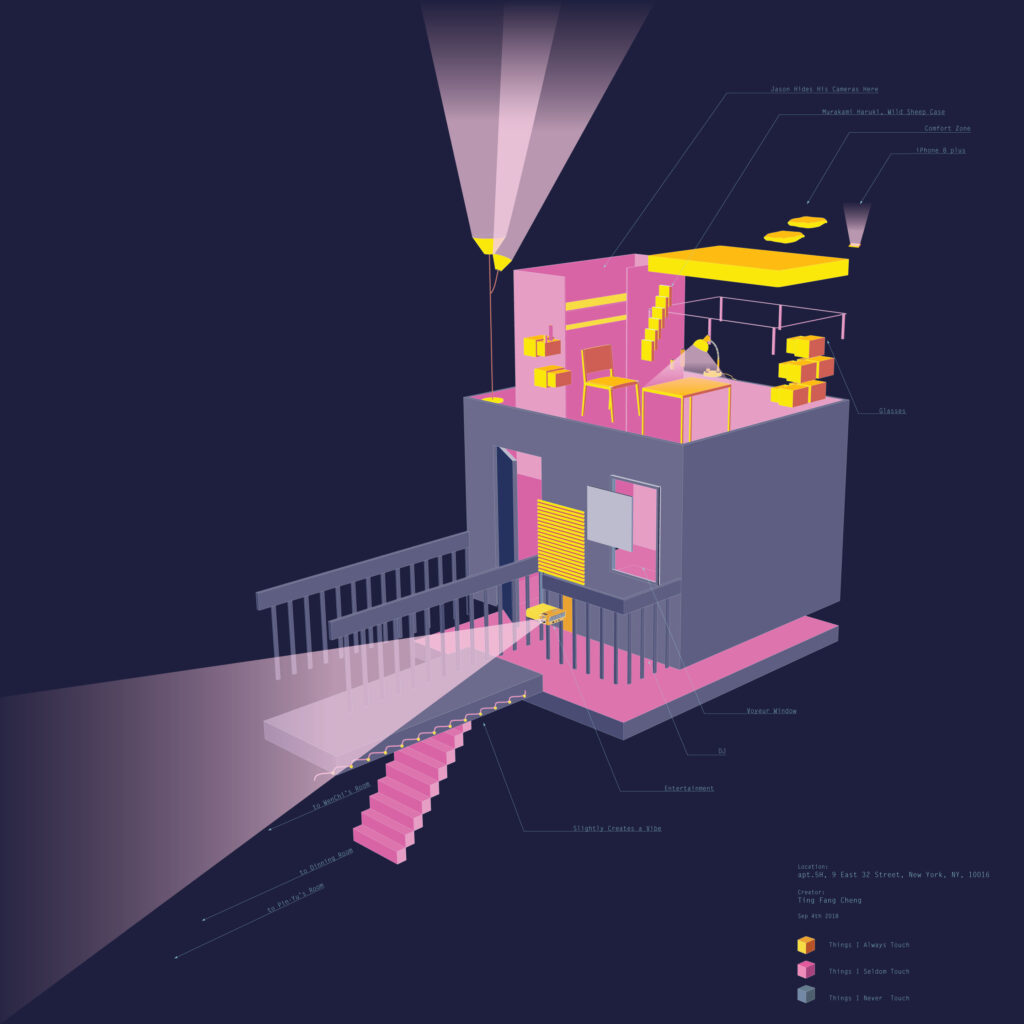
In addition to her professional responsibilities, Cheng uses data visualization to discover the aesthetic of daily life. One such project was created during her Master’s degree at Parsons, where Cheng collected data from her own apartment and how it was organized. She transformed this information into an artwork named “My Room.”

By modeling her own room and presenting her daily routine with colors and lights, Cheng was able to better understand the relationship between people and their living space through this journey of self-discovery.
“Like a typical New Yorker, I am often looking for a new apartment and trying to adapt to the new environment. An apartment displays authentic and persistent statements about inhabitants at that moment. I enjoyed dedicating extra time to observing mine because it was an opportunity to review my day-to-day behaviors and choices.” Cheng recognized this artwork as a lens into her life, which provided much self-discovery. Her goal with this artwork was to present how humanistic data can be.
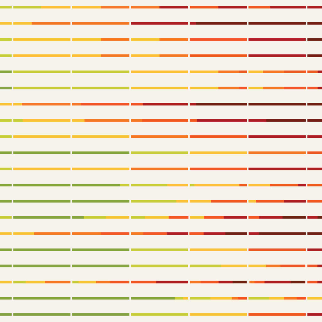
Cheng believes that data visualization can display emotions beyond raw data. “Bar charts and pie charts can be overly rational at times, and I believe that data visualization can be more than that. I am always looking for inspiration to create non-traditional visual models that resonate with the audience in a more humane way.” Cheng said. A project that represents that ideal was “The Patchwork of Fall”, where with the help of technological design tools, Cheng redesigned the traditional fall foliage map. The project aims to display the patterns created by nature.

The color combinations and iterations of fall foliage carry an air of mystery and inspiration. It reminds her of a beautiful quilt created by nature. Through the artwork, Cheng hopes that the audience will connect with nature in a new way. Compared to a traditional foliage prediction map, by decoding them by nature, Cheng applied a humanistic, and even romantic approach to designing a fall foliage map.
Cheng’s background in exhibition design and curation influenced her beliefs that data can be seen as a medium for visual design and storytelling. She believes that data is not limited to print or digital dashboards but has the potential to live as a physical format where the audience can observe and experience the medium in different ways. Currently, at Pentagram, she is working on a wide range of topics, such as climate change, social justice, gender equality, and more.
Cheng said, “Data visualization is full of humanity; presenting data in a more relatable, and emotional way will help the audience to engage more deeply with sometimes cold, and rational facts.”
You can learn more about Ting Fang Cheng by visiting tingfangcheng.com


