Timelines are visual depictions of an itinerary of activities over a predetermined period. They serve as efficient project management tools by assisting experts in estimating how long a task would take. You can manage projects better if you comprehend how a timeline is created.
In this post, we go over how to create appealing timelines so you can make them attractive when showing them to your team or classmates.
Use colors to distinguish between events.
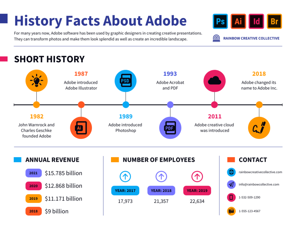
Colors can be a helpful way to differentiate between events. For example, if you are tracking the timeline history of a company, you might use one color for each decade. Or, if you are creating a timeline of events leading up to World War II, you might use different colors for different countries.
Using colors can also help to emphasize certain circumstances or periods. By using colors judiciously, you can create a timeline that is both informative and visually appealing.
Create a header to outline the different sections.
You can format your heading in a few different ways. The most important thing is to be clear and concise so your reader can easily follow along. You may want to include the name of the project or event that the timeline is tracking and the covered dates. You can also add additional information, such as the location or relevant keywords. Once you have decided on the information to include, you can use a variety of design elements to make your header stand out. For example, you might use colors, typography, or images to catch your reader’s eye.

Use images and videos.
Adding images and other multimedia can help design a more visually exciting and easier-to-follow timeline. For example, you can use images to highlight critical events or personalities. You can also use videos or audio recordings to add another dimension to your story. Using multimedia, you can make an informative and engaging creative timeline.
Add labels to your events for clarity.
A timeline is a great way to visualize data, but it can be challenging to understand without labels. Adding labels to your timeline can help to clarify the information and make it easier to interpret. For example, you might label each data point with the date or time, the value of the data, and a brief description.
You can also use labels to highlight essential features of the data, such as trends or outliers. In addition, you can use an annotated timeline to help understand the data, such as notes on methodology or sources. By adding labels to your timeline, you can ensure that your data is clear.
Use a different font or text style for different kinds of events.
Creating an effective timeline can be challenging, as many different ways exist to format the information. One way to make a timeline more user-friendly is to use different fonts or text styles for different types of information. For example, event dates can be displayed in a larger, bold font, while detailed information can be presented in a smaller, regular font.
Using different fonts or text styles can help your audience quickly identify the most critical information on the timeline.

Group related events together.
A timeline is a chronological list of events that have happened or will happen. You can use it to track the history of a person, country, or project. When creating a timeline, it’s important to group related events. It will help you see patterns and connections you might not otherwise notice. It can be beneficial when trying to understand complex historical processes.
Use arrows or other icons.
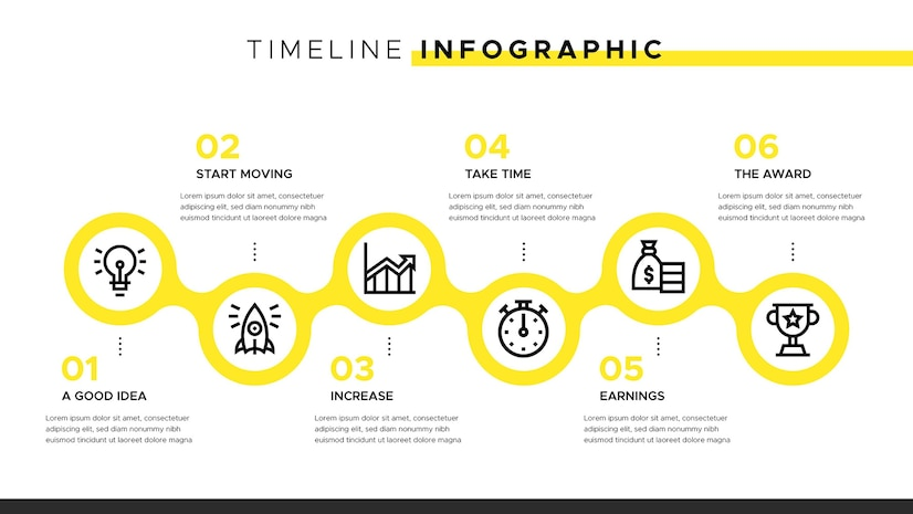
When making a timeline, it’s important to use easily recognizable icons or symbols to help communicate the information at a glance. Arrows are often used to indicate the passage of time, but other symbols like dots or boxes can also be used.
Use callouts to highlight important information.
It is vital to include callouts to highlight important information.
Callouts are small boxes you can add to a timeline to draw attention to critical events. They can be used to add additional details about an event or to provide a brief description of its significance. Callouts are an effective way to ensure that your audience does not miss important information.

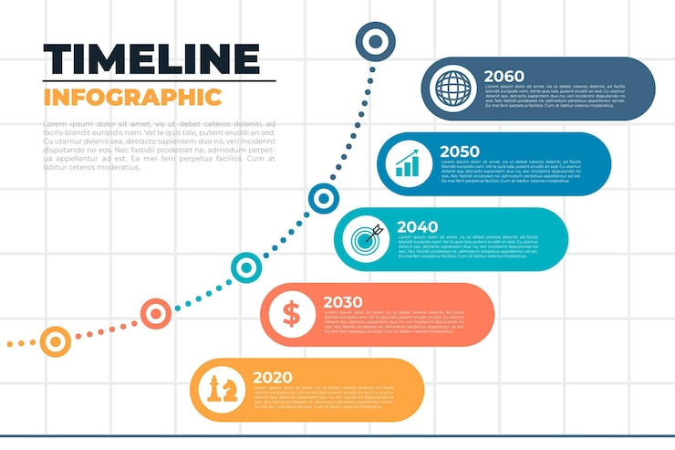
Use a creative layout to make your timeline stand out from the rest.
As anyone who has created a timeline knows, choosing the proper format is essential to making your timeline look its best. A good design can help you highlight the most important parts of your story, while a bad layout can make even the most exciting data look dull and confusing.
The best timelines have been explicitly designed for the data they contain. You can find a timeline maker to help you choose the best-designed template for your goal or information. In addition, this tool includes organizational chart examples, infographics, and other templates you can use for anything you need.
Conclusion
It is vital to make your timeline appealing to capture your viewers’ attention. You don’t have to struggle when making an impressive design. Venngage is an online platform you can use to create a timeline for any topic. They offer a wide variety of templates that suit your needs. Sign up today to get access to their layouts.


