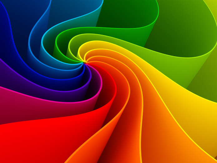
Color in any design is its vital element from every domain. Whether intentional or not, colors add meaning and value to the design and spur emotions. The perception of any color is entirely subjective, but the psychological influence of some colors is universal. Warm colors trigger emotions ranging from warmth or hostility. Calm colors are the actual representation of peace or satisfaction.
The effective use of colors in a design may send a positive or negative message to the viewers. Hence, the best way to ensure that the color palette is transmitting the expected message to the users is to understand their vibe and evaluate them in the design context. Many images and video editing software are relying on the same theory to fulfill their target audience expectations.
The Trends and Culture of Color
From a cultural to a modern standpoint, colors have various aspects worth considering. Colors are also associated with political, sports, motivational, and other organizations or sectors’ thoughts. It is crucial to understand the cultural aspect of the color palette. For instance, in western, Native American, and Japanese cultures, black represents death, but in Chinese or Indian cultures, white represents death.
Sustainability or simplicity of consumer trends may have a serious influence on the color trends as well. To keep up the same trend, various products have been going green in the past few years. In most cases, the color palette is hugely based on the brand identity of the client. When it comes to color, use the color palette, a combination that works for the audience and the client. The color must also align with the objective that you are trying to convey.
Why are Colors important for a Design?
Colors are the primary essence for any design, whether you are working on illustrator or Photoshop. Additionally, every color has its meaning and message, i.e., warm colors show optimism, excitement, and cool colors that symbolize harmony and peace. Choosing the accurate color is important for the design. The colors in the design must have a purpose to fulfill to make it meaningful.
Why should you have Colors in a Design?
In design, colors have the potential to either draw your attention towards it or make you look away from it. It also acts as an emotion that might be as powerful as your favorite music or amusements. Colors can make viewers instantly understand the concept of the design. It is intrinsically essential for the design as it helps viewers to respond and relate to its core.
Colors improve the appearance and object identification of the design. Just to name a few, its major reasons are-
- Improving the meaning of the design
- Conveying the structure of the design
- Setting up design identity
- Highlight symbolism of the design
- Enhance the usability of the design
- To represent links and communication modes.
- Expressing the figure of speech
Colour Symbolism
We have now understood that color depicts the meaning and concept of design. For instance, the blue color is the symbol of calmness; red symbolizes attention, and so on. However, the color choice is highly subjective, where each genre specification has a different understanding of the colors. Hence, it is necessary to precisely understand a color and analyze it as per the target demographic before choosing the elements.
Moreover, there are universal color standards as well; for example, red color communicates with users depending upon the ideas under every context. Red is also associated with extremity, warmth, or danger. In branding or advertising, red color is the representation of confidence, strength, and power.
Colors, Designs, and Improved Visibility
Designing, irrespective of the color used or the layout, is entirely about balancing the appearance. The more complex the color and the scheme of the design, the more complex it is to balance its appearance. The perfect color on your palate will always remain dominant, and it can also support the design hue. You can pay attention to how all the colors are interacting with each other in the design. This is to assist in reading text, especially.
The basic thumb rule followed by many designers is 60-30-10. It is a three-color palette rule that can be applied to the designs along with creating harmony with it. The fundamental color dominance is 60%, the accent is 30%, and the balance hue is 10%. Another way to keep the color palette organized and balanced is by using the tents or shades of any one hue.
What do some of the Common Colors translate into?
The combination or indulgence of hue, saturation, tints, chroma, shade effects, value, and other elements are considered to know how the users/audience/viewers perceive colors.
Warm Colors
Warm colors, most importantly, include red, orange, and yellow. These colors are associated with passion, anger, or attraction. Red is a primary color that stimulates energy and guarantees engagement.
Cool Colors
Cool colors are inclusive of green, purple, blue, and they are more subdued than the former category of colors. Blue is a primary color that has a soothing spectrum. These colors can be used in a design to give it a sense of professionalism and calmness.
Neutrals
Neutral colors in any design only serve as the backdrop, and they are often paired with bright colors. Depending upon one’s creativity, they can either be used on the main concept or can be used to develop sophisticated layouts. The art and the representation of neutral colors are affected by their surrounding colors.
Black Color
Black is the strongest neutral color that has a positive as well as a negative impact, depending upon how it is used.
Summary
Colors are critically crucial across the designing fields, among which the major ones are graphic designing, video editing, visual effects, 3D animation, etc. Warm colors, cool colors, neutral colors, or pastel colors have a serious impact on a design. As colors represent the sense of understanding and direction, they are the functional elements of designs.


